menu
close
The identity behind a life lived unbound.
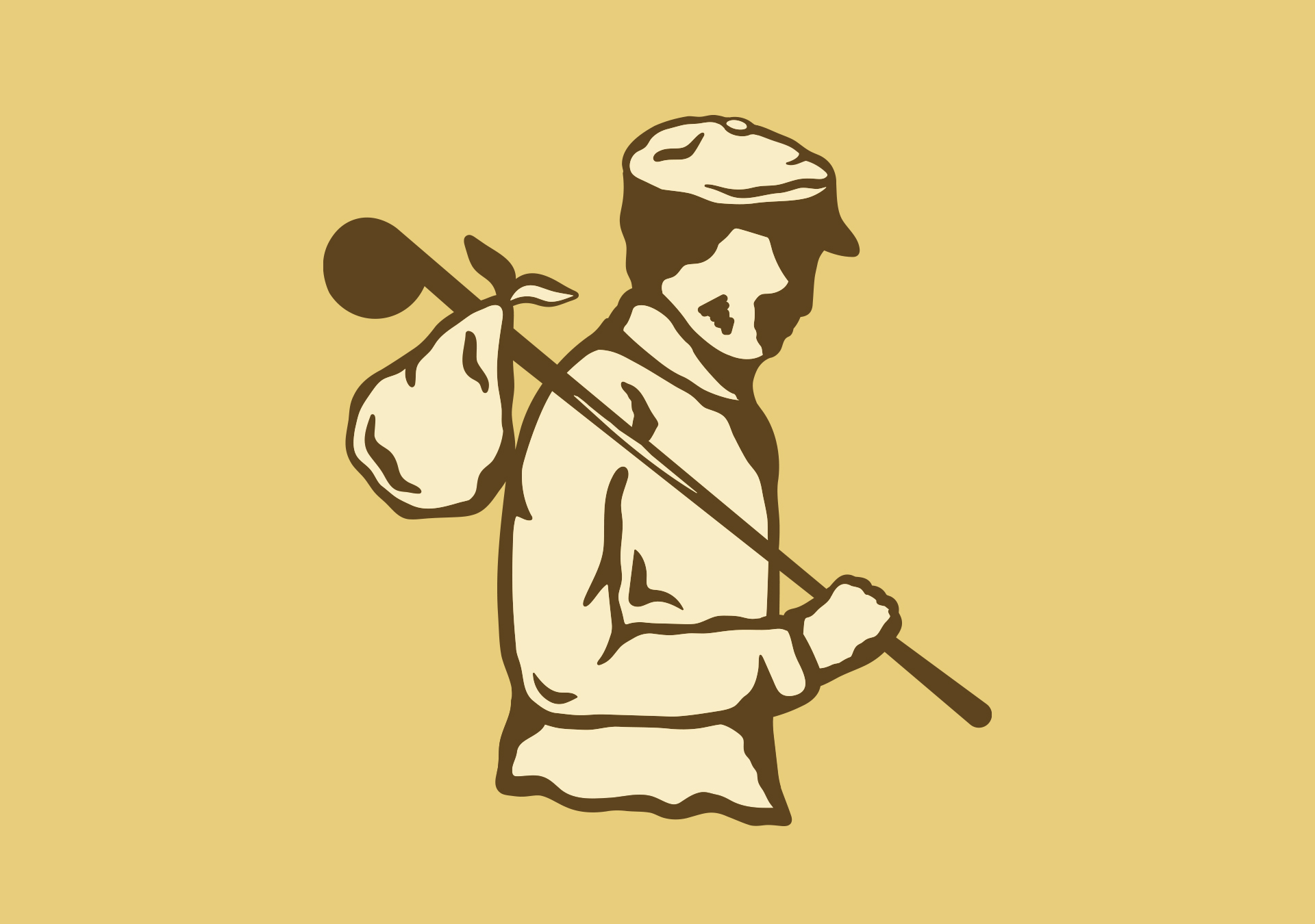
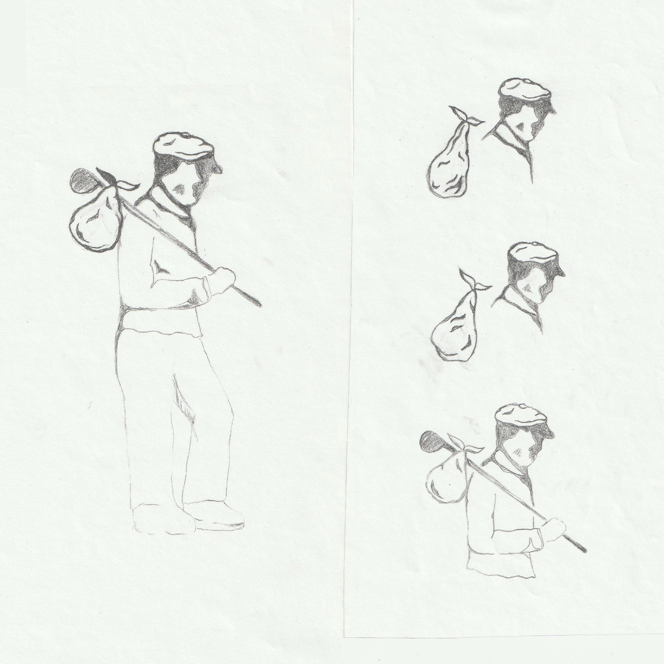
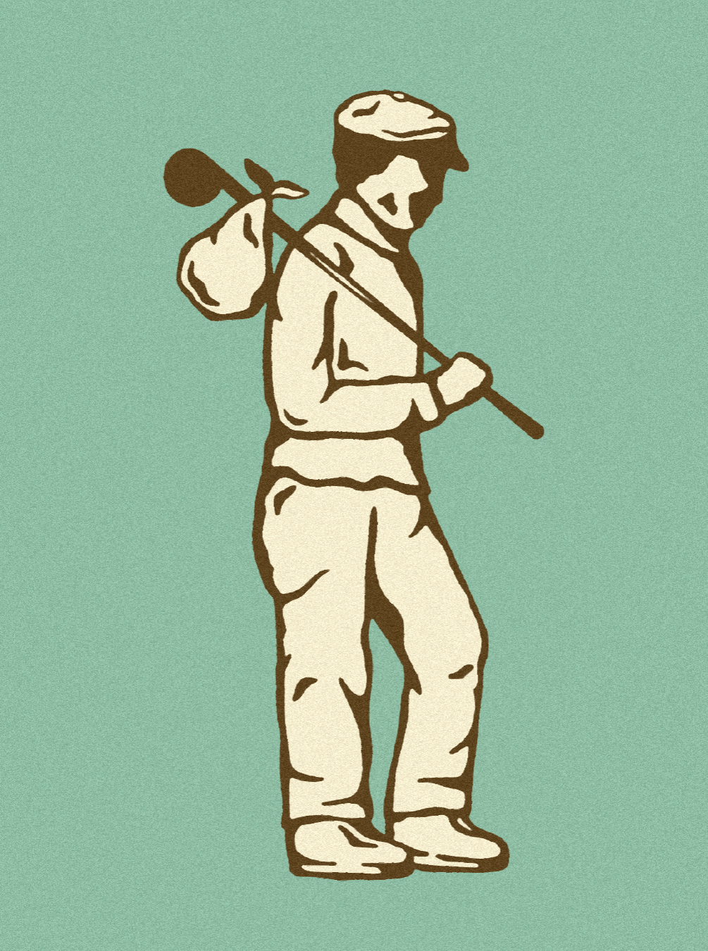
Drifter’s Bindle began with a simple yet pointed idea: a vagabond and their worldly possessions neatly wrapped on their back. The image characterizes the symbolism of the liberation that stems from a life lived outdoors. The brand essence was there from the start, just below the surface, rooted in a quiet curiosity and vintage minimalism, awaiting a clarity and a point of view that could carry beyond a single product or moment.
Our role was to fashion that spirit into a brand with intention. What started as an idea around tees and hats became a fully realized identity.
The discovery phase was about identifying the deeper beliefs behind the brand and clarifying its place in the outdoor landscape. Through conversations and research, the idea of ‘Living Unbound’ surfaced as a natural expression of that point of view. It speaks to a life guided by intention rather than accumulation.
That perspective shaped the brand from the inside out. Drifter’s Bindle aligns itself with those who step away from noise, finding meaning in simple time spent outdoors.
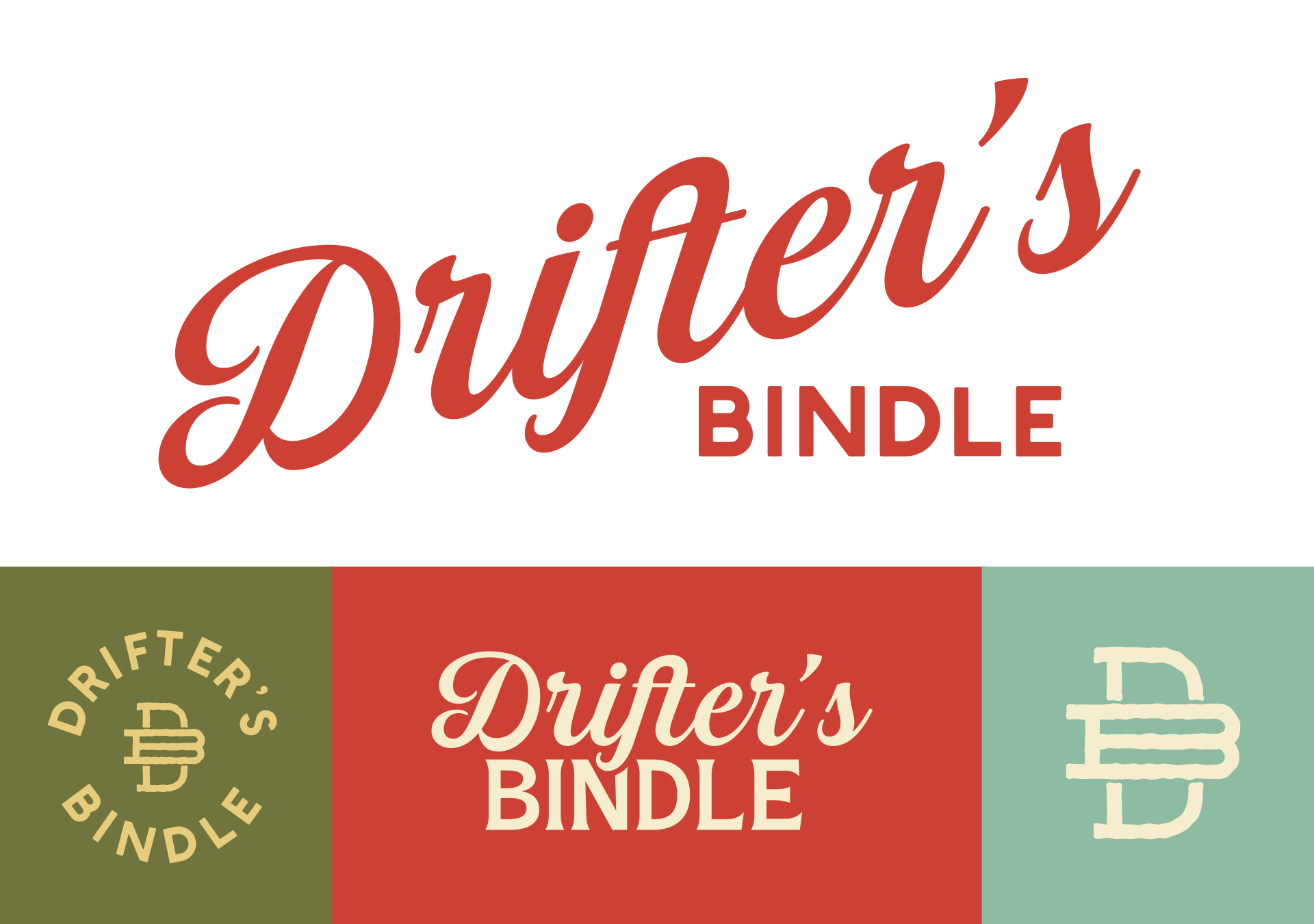
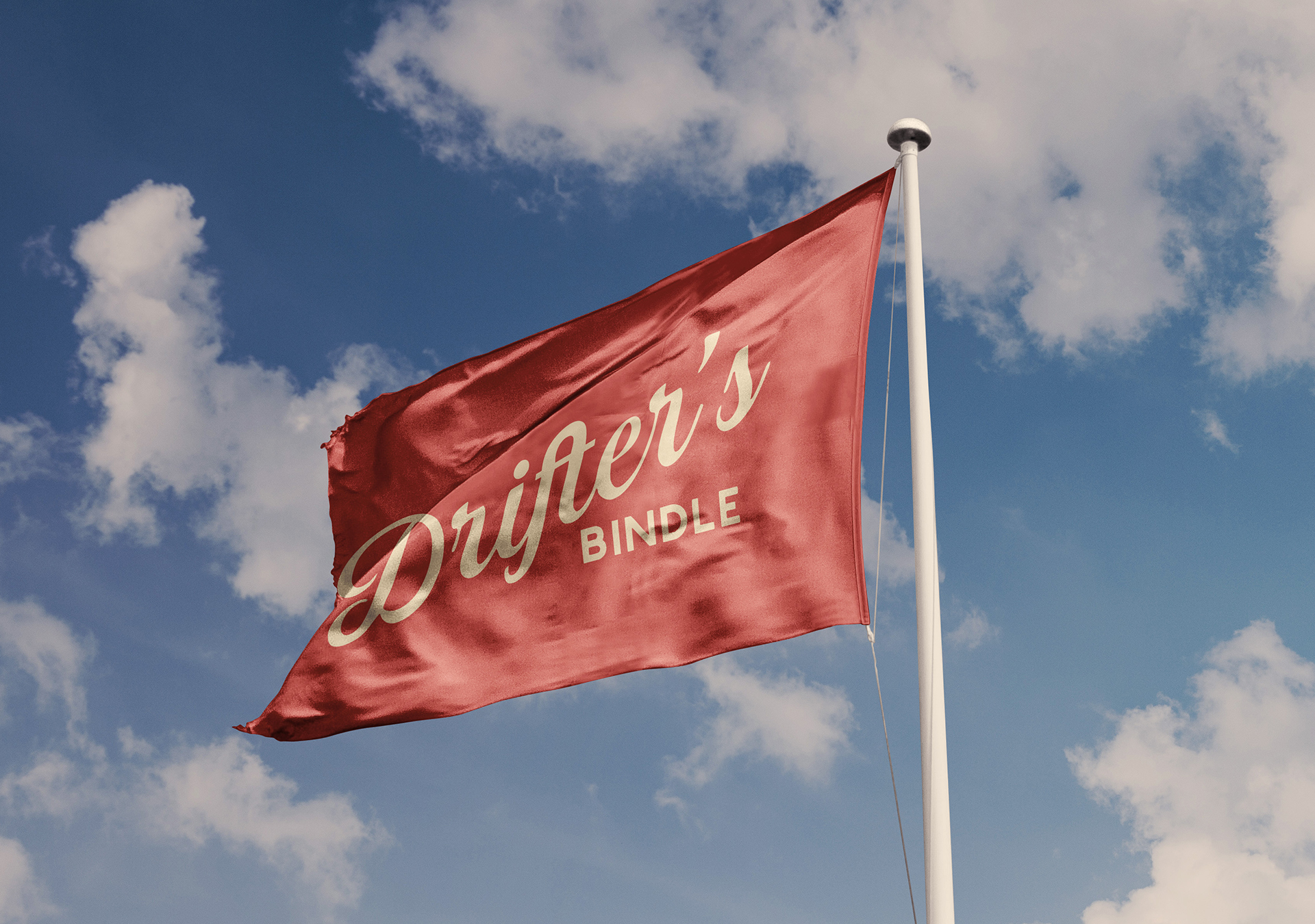
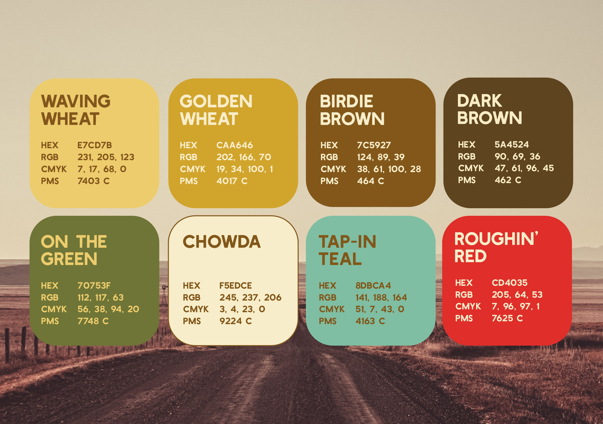
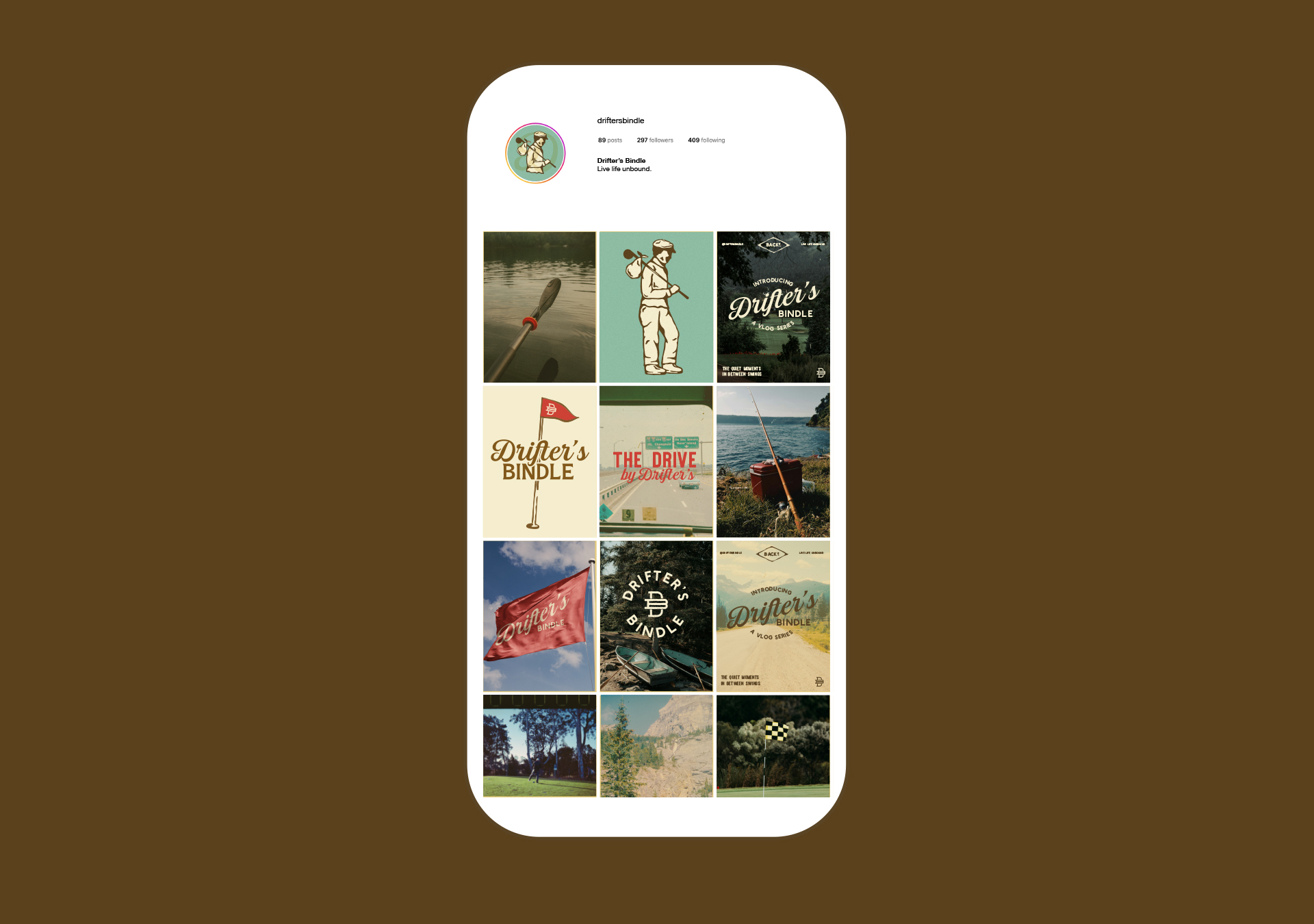
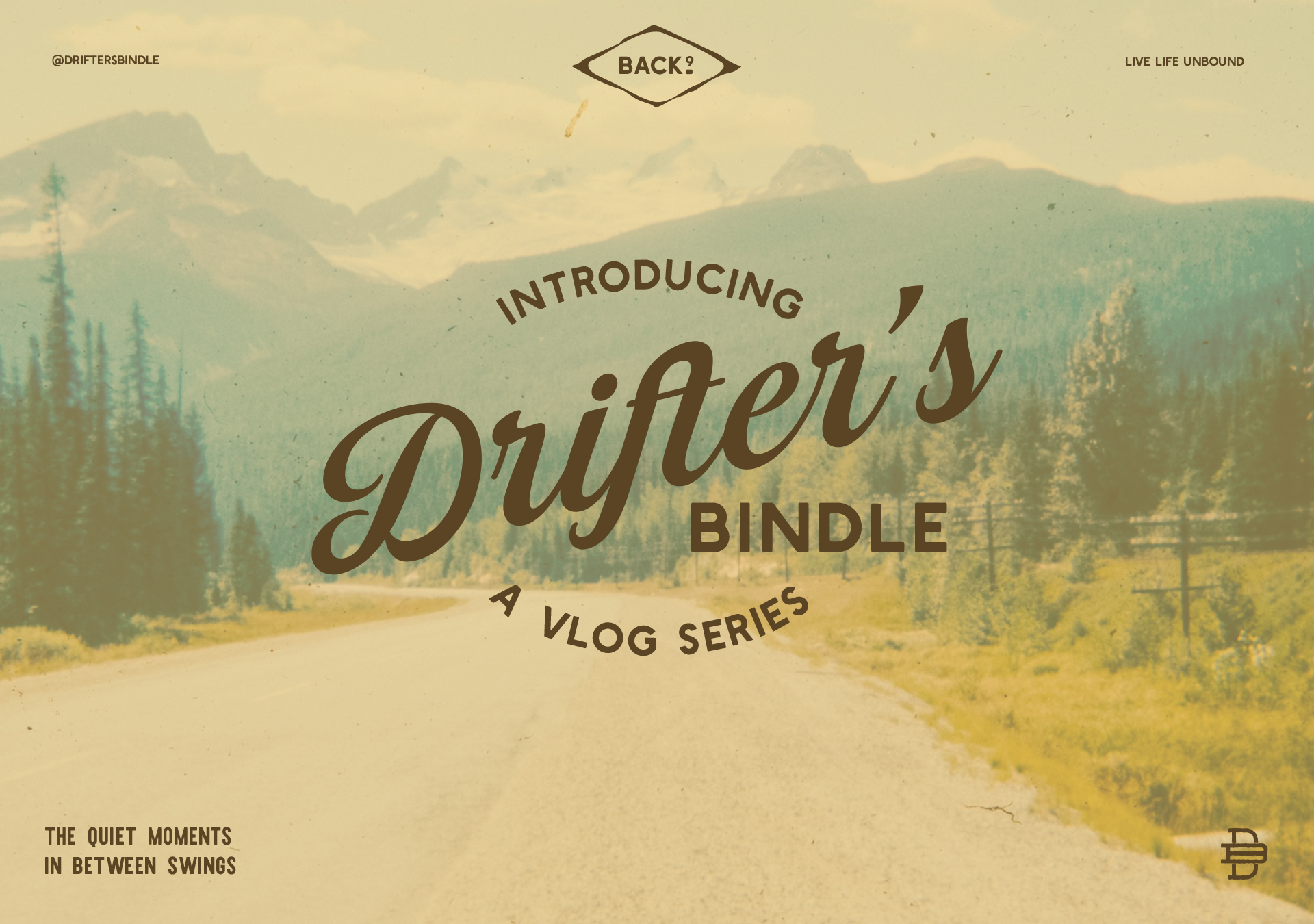
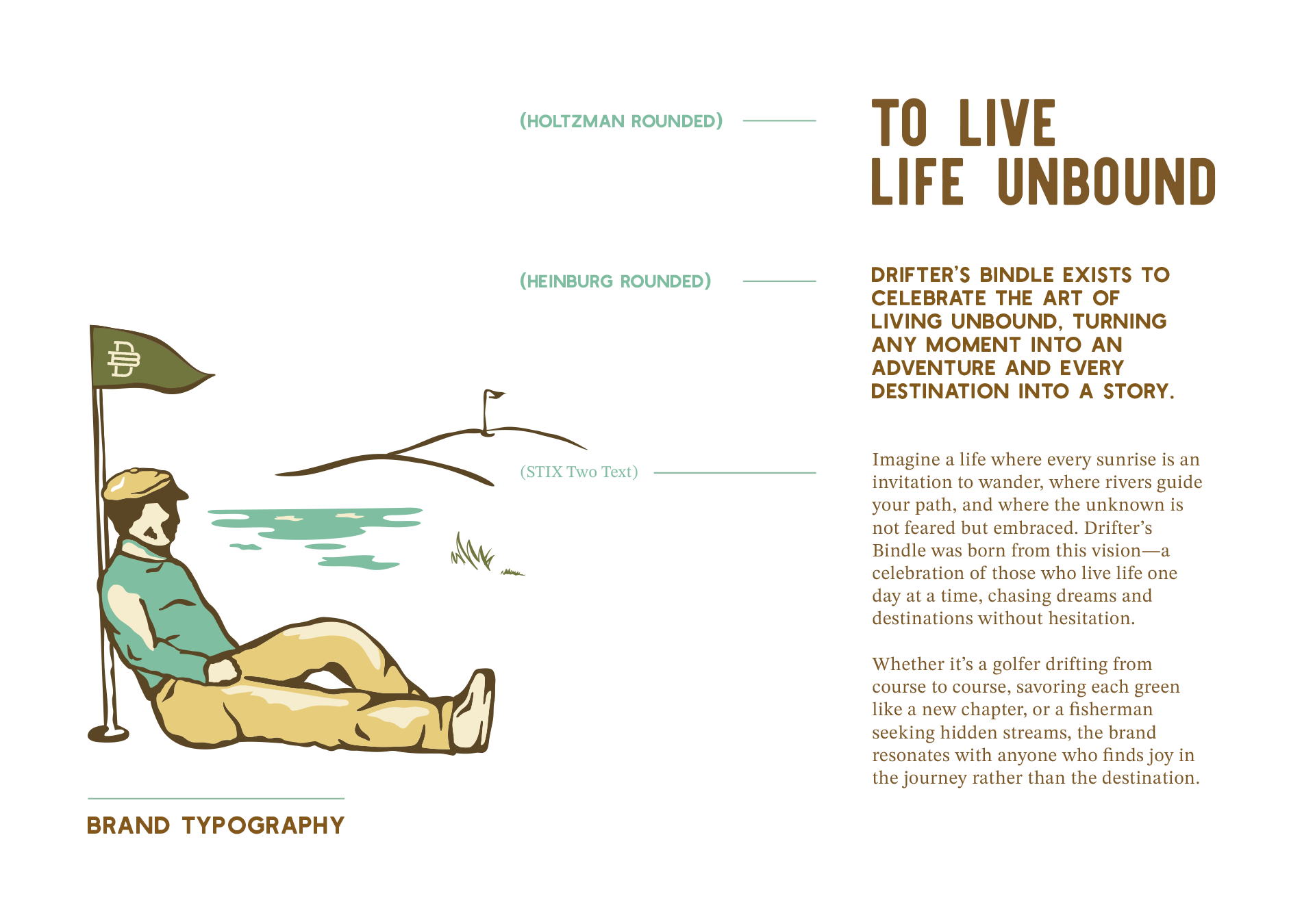
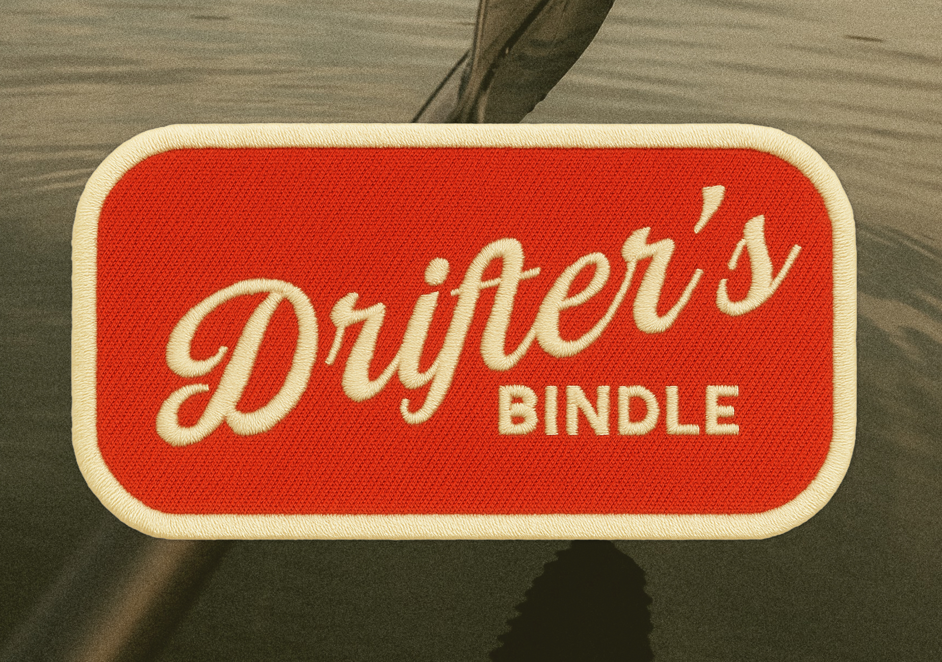
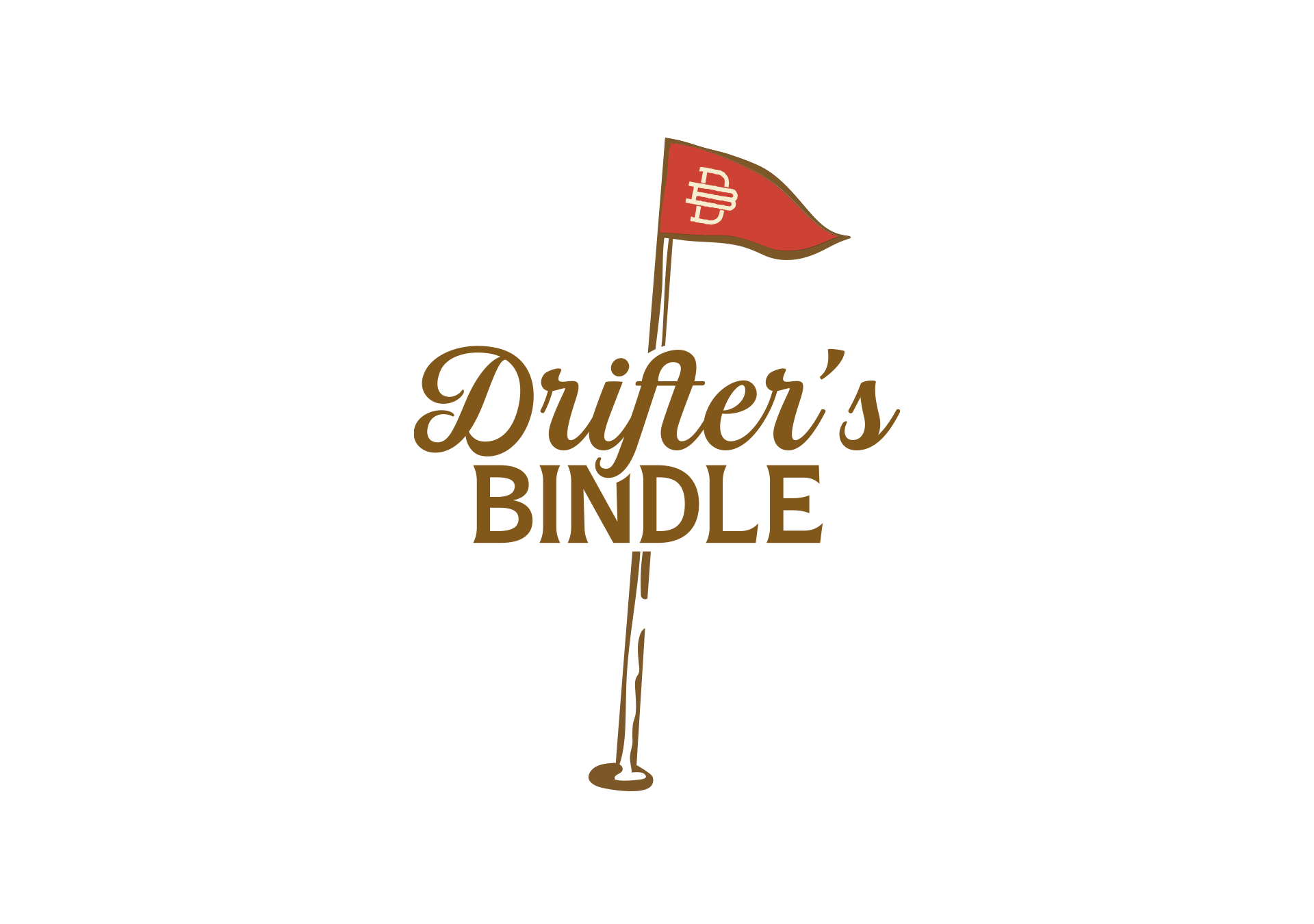
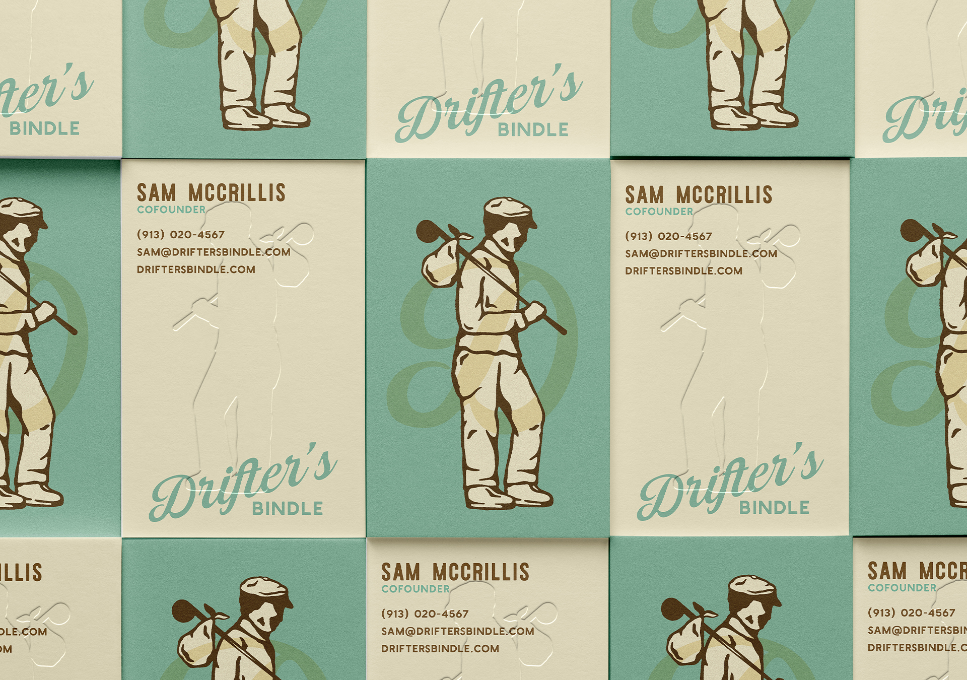
Visually blending vintage Americana with modern restraint, the identity feels worn in but intentional. A hand-drawn drifter and heritage word marks are saturated by earthy colors that ground the system.
The result is a brand that exudes nostalgia. From fairways to forests, shaped by real experiences and a quiet rallying cry: go outside and live unbound.