menu
close
A freight brokerage built for speed and integrity.
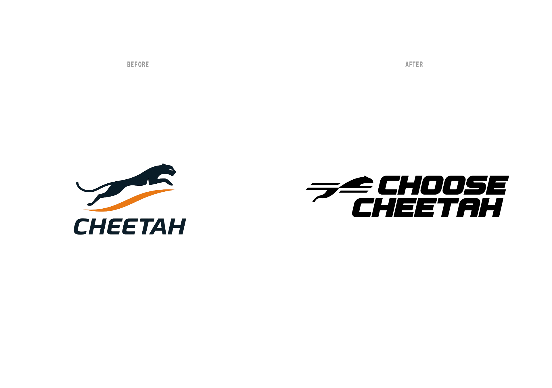
Choose Cheetah started with a clear instinct. From the onset, this brand had to embody speed and motion. The cheetah was an obvious symbol, but the original execution lacked distinction.
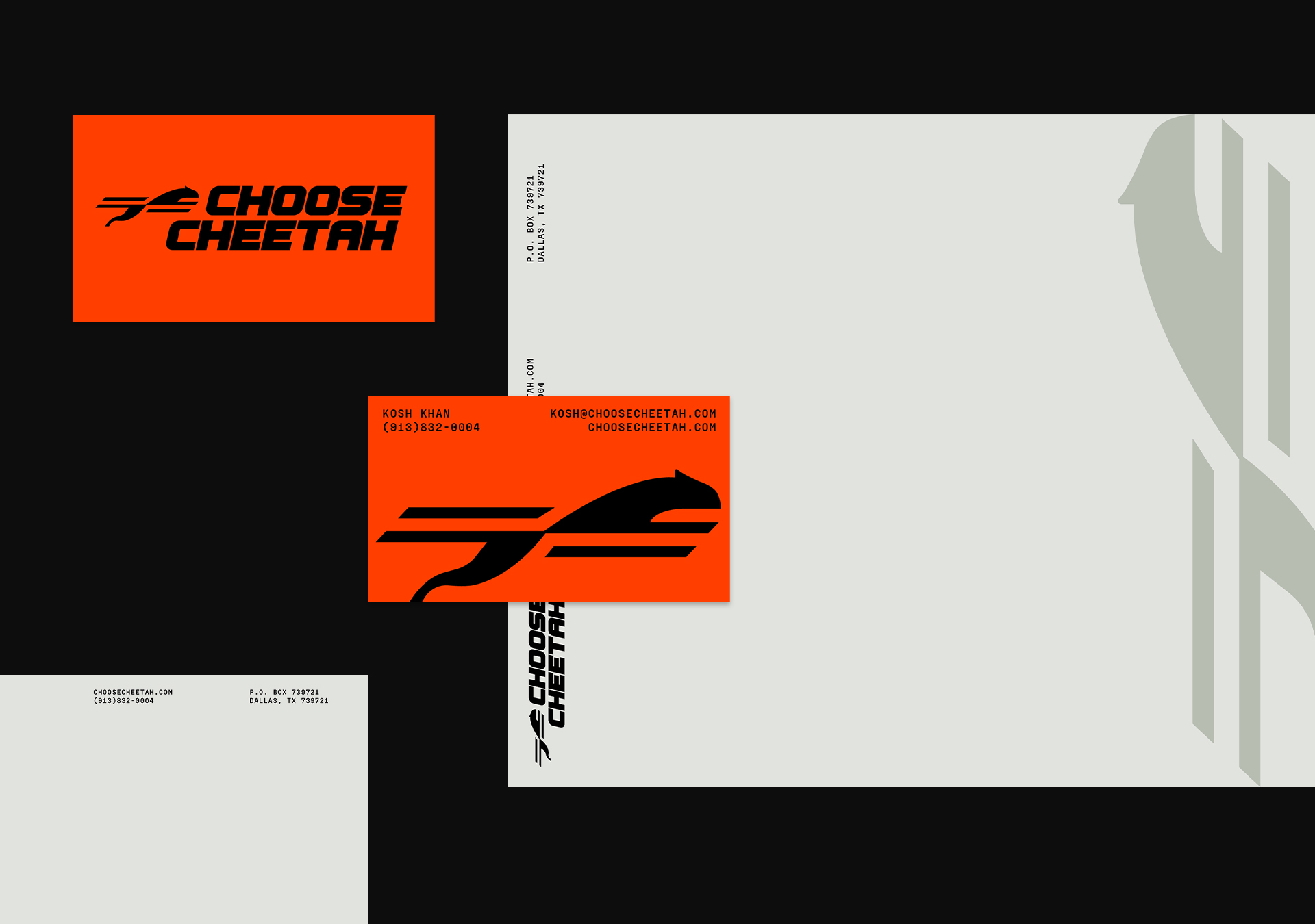
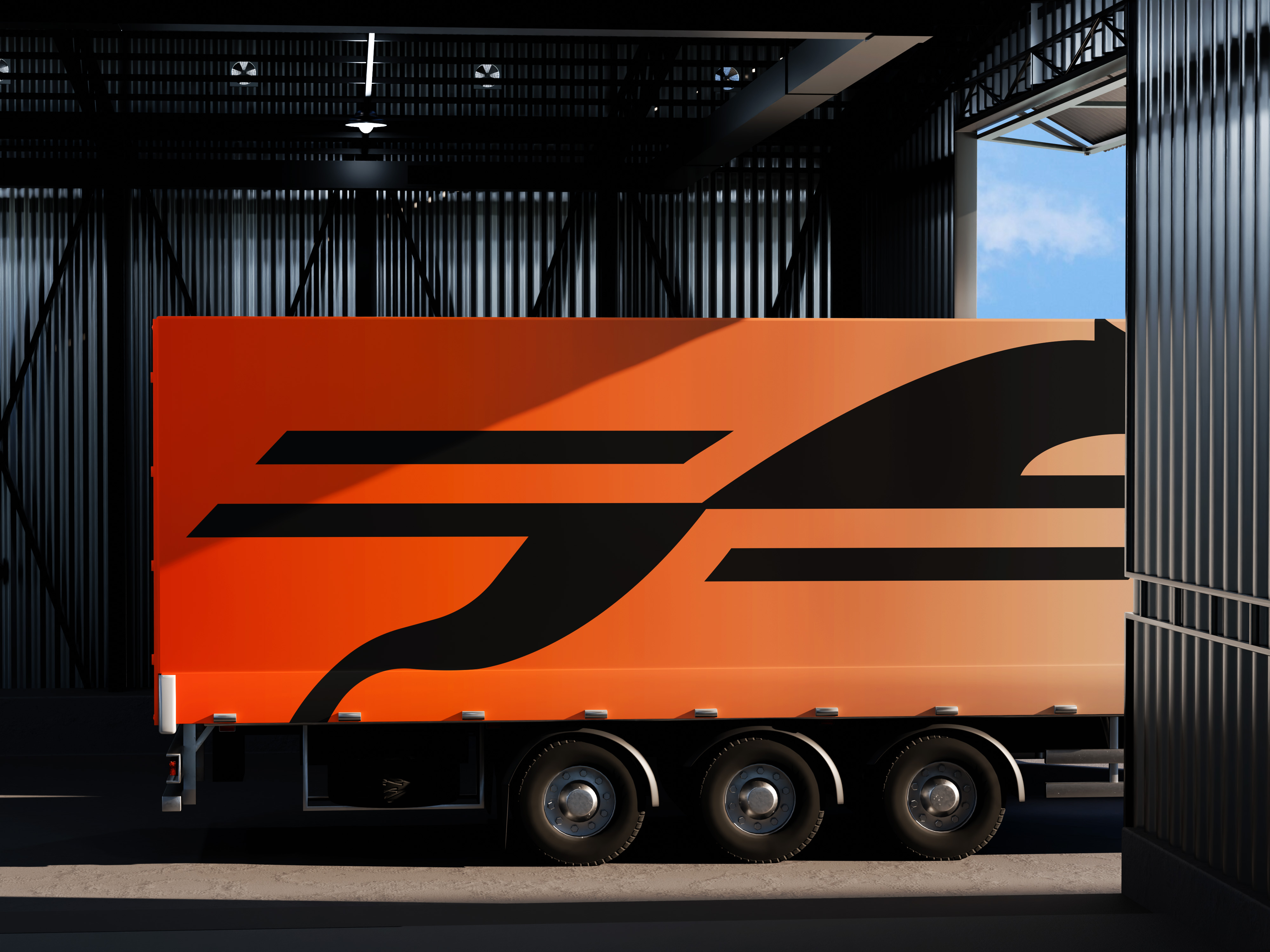
The owner came to us and had a clear idea of the industry's ins and outs, but wanted an identity that reflected their desire of a new way of doing things. We set that in motion, reshaping things into something the brand could truly own. What followed was a complete visual system, mirrored on how they move freight and operate.
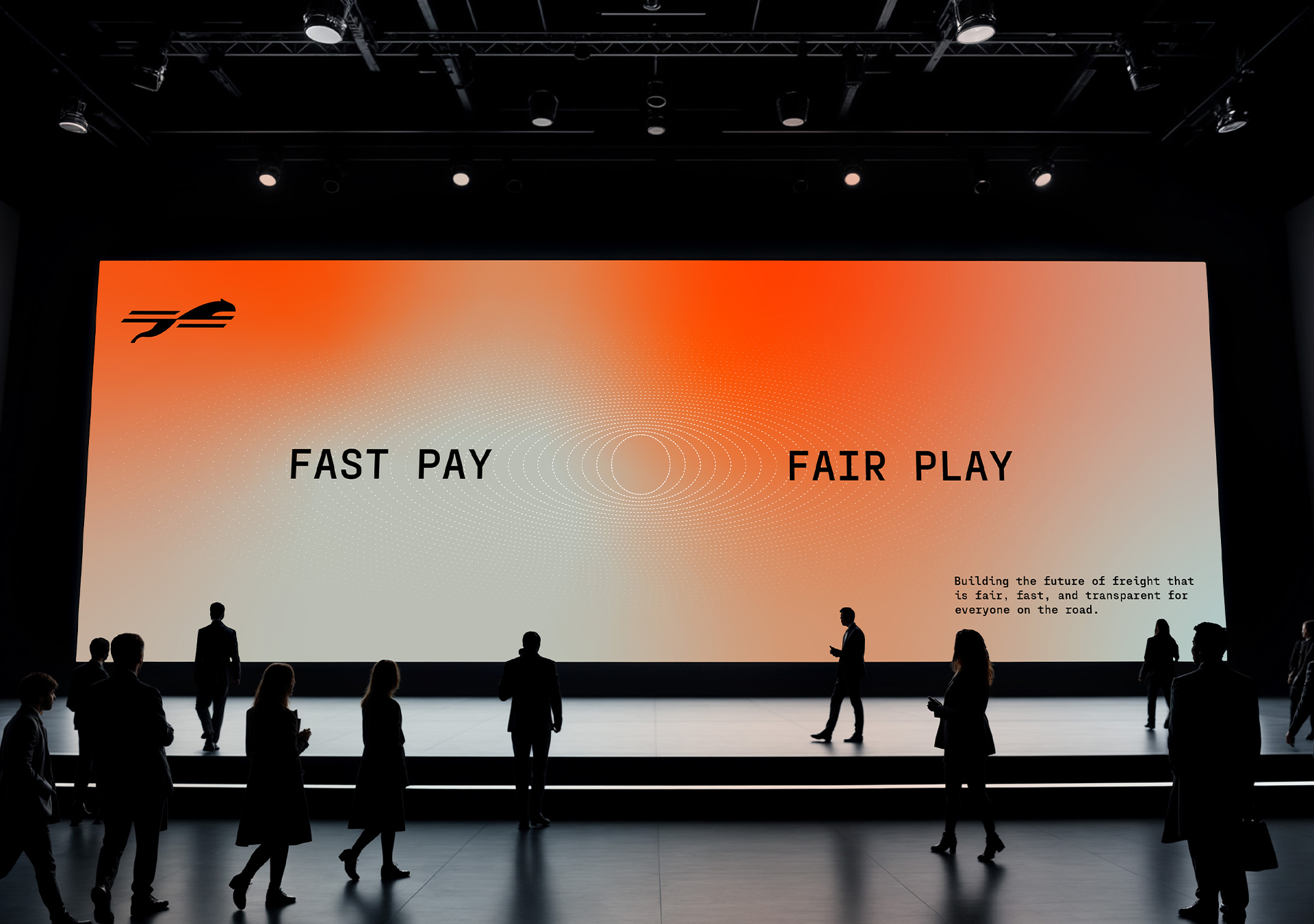
At its core, Choose Cheetah is working to rebuild trust in freight. Not only through their operations, but through a belief that speed doesn’t have to come at the expense of integrity.
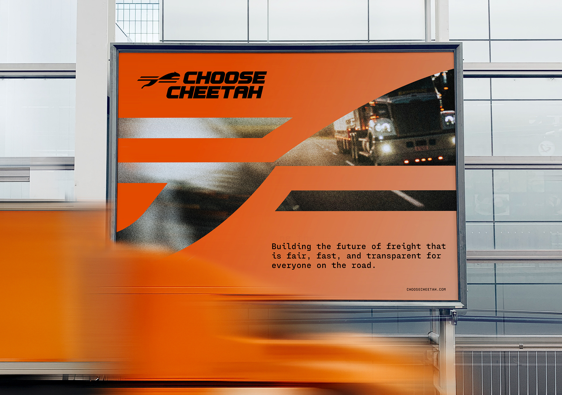
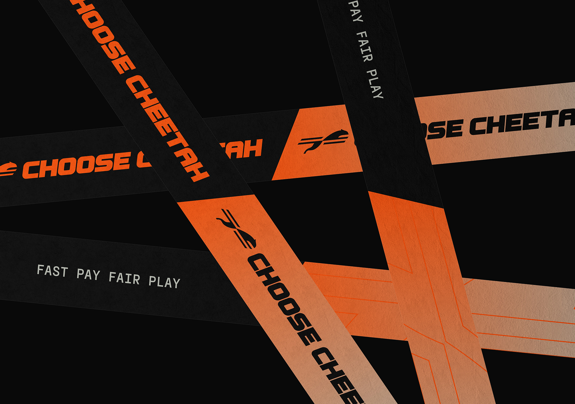
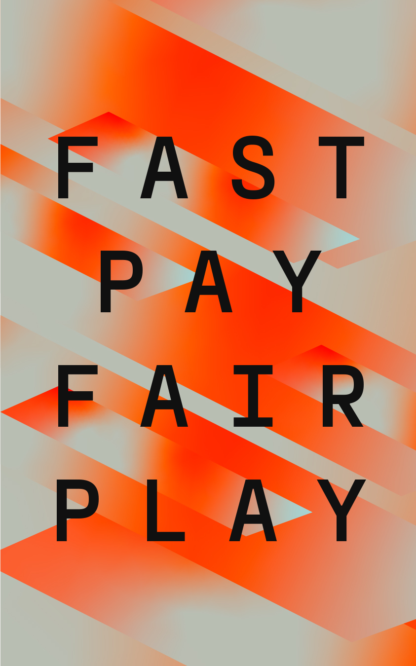
‘Fast Pay. Fair Play.’ emerged. Becoming a tagline and guiding principle for the brand. Positioning Choose Cheetah not just as a broker, but as a empathetic force within an industry hungry for change.
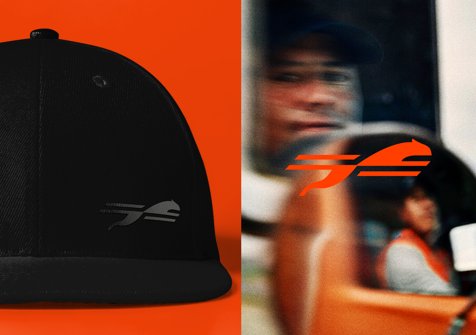
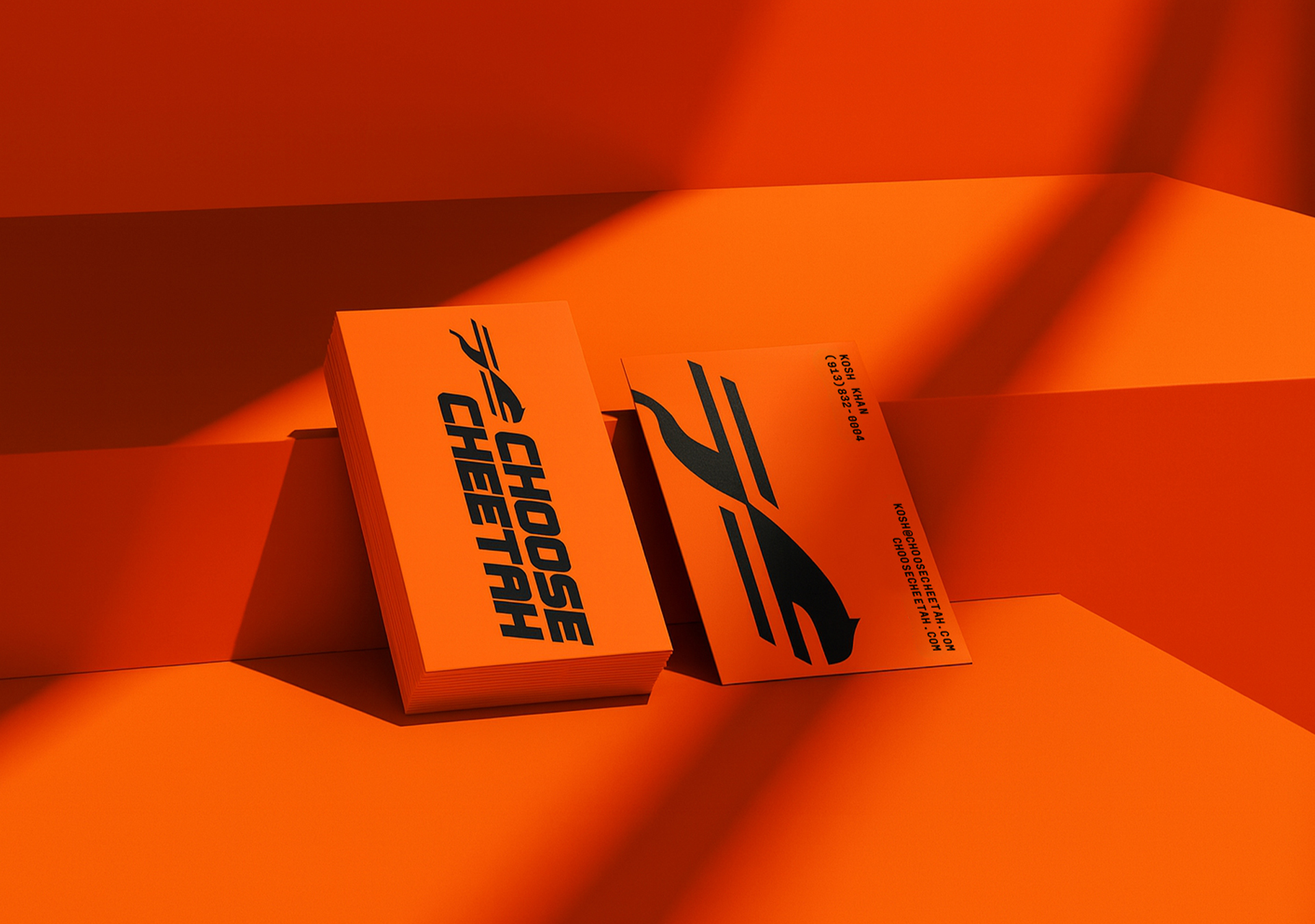
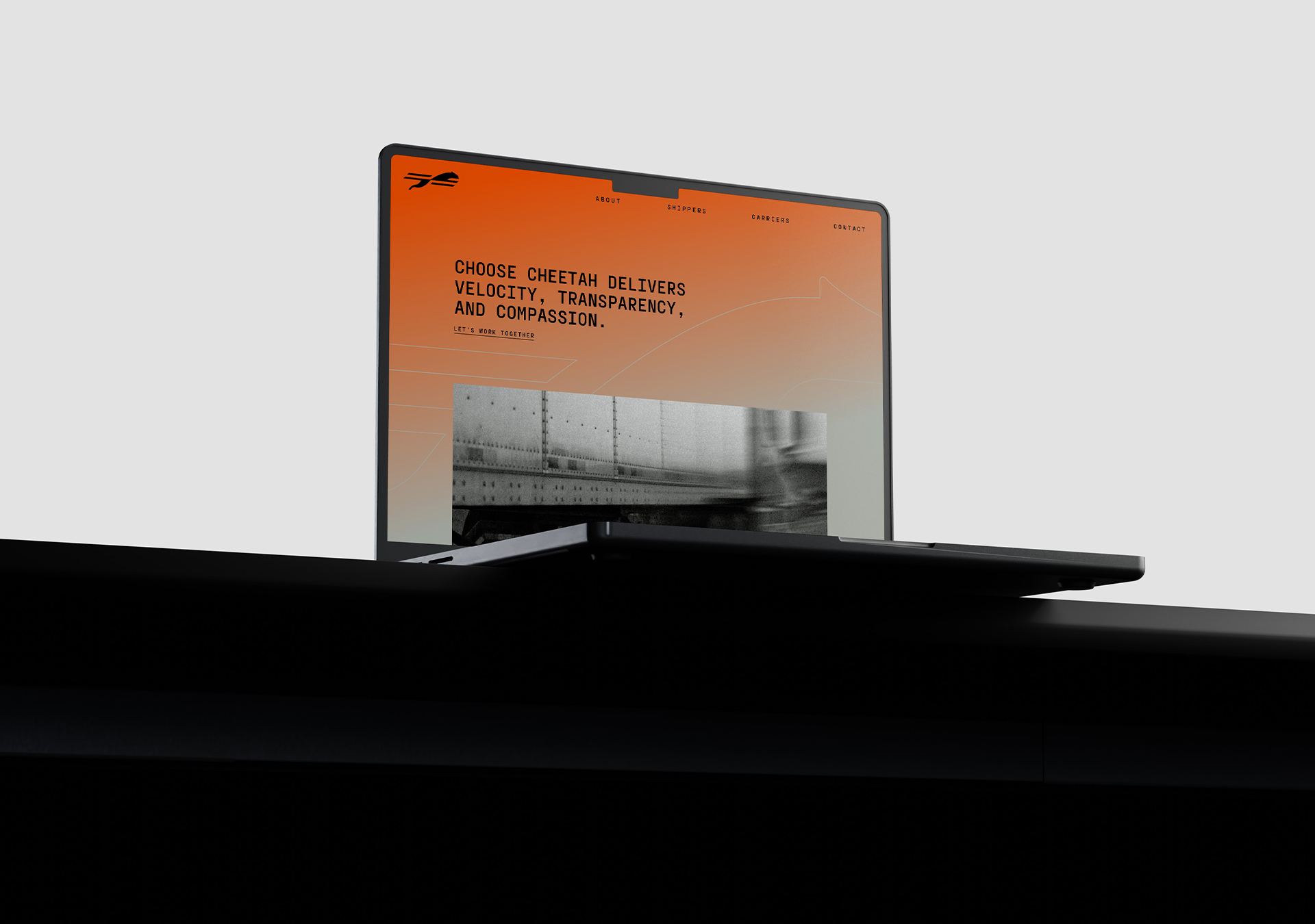
The identity distills the original cheetah concept into a mark that is distinct, ownable. One that balances simplicity with flexibility, giving them the pieces needed to operate confidently at their cadence.
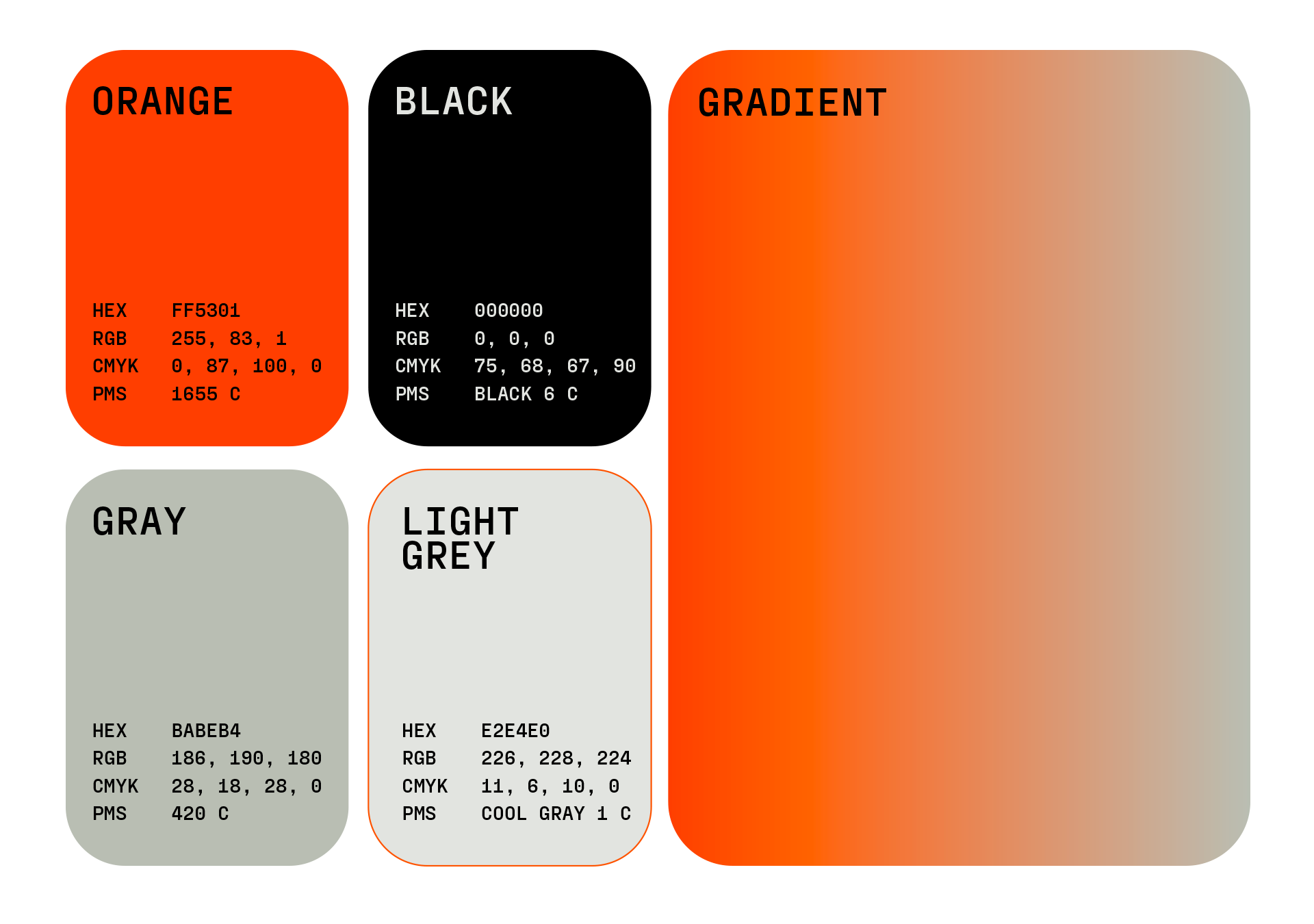
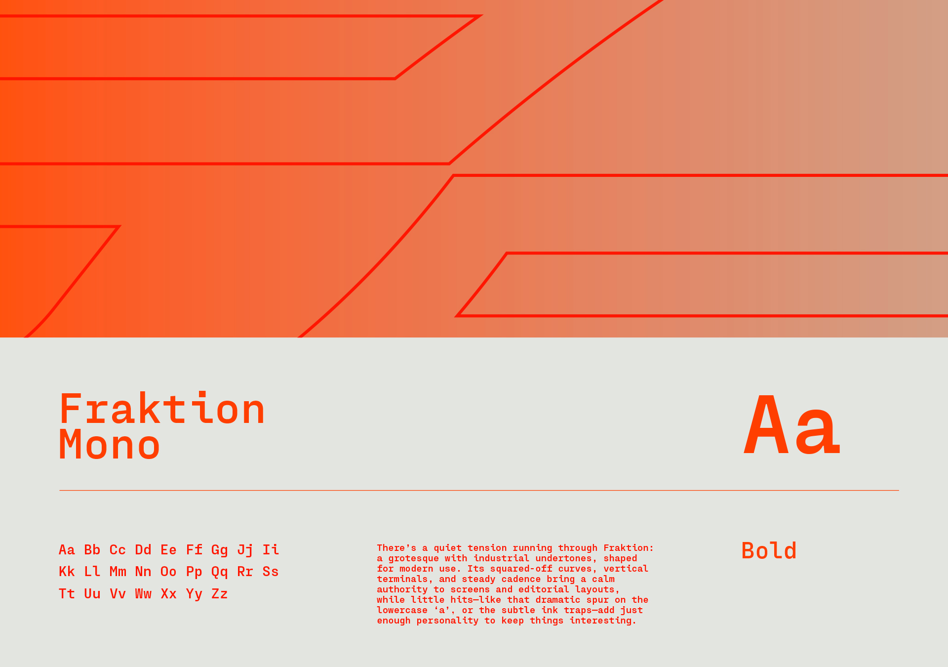
That same energy carries across the system. Confident typography and a bold, unapologetic palette reinforce a brand that knows where it’s going and how it intends to get there.